


Retro Mode - Icon Pack (Neon)
4.6240.00 Reviews
App Specs
- Version
- 2.1.0
- Updated On
- License
- $2.79
- Downloads
- 50,000+
- Developer
- Moertel Pixel Art
- Categories
- Personalization
- Platform
- Android
Screenshots
 Analysis by AppCompare
I judge an icon pack by more than its first screenshot: the artwork has to suit the way I use my phone, and applying it shouldn’t turn a small customization project into an afternoon of troubleshooting. Retro Mode - Icon Pack (Neon) makes its case with an arcade-inspired look, but it is most appealing when that style feels like something you want to see every time you unlock your screen. If you prefer a quieter or more realistic interface, the same boldness that makes it memorable could wear thin.
Choose the look you’ll enjoy every day
Before choosing any icon pack, I’d think about the apps that occupy your home screen and how much visual change you actually want. A neon theme has a strong personality: it can make a carefully arranged screen feel unified, but it can also draw attention away from a restrained wallpaper or a minimalist layout. I’d start by picturing the pack beside my usual background, rather than deciding from the icon artwork alone.
It also helps to ask how you navigate. If you rely on recognizing familiar app logos at a glance, a redesigned set may take a little adjustment. For someone who likes a coordinated home screen and doesn’t mind learning a new visual pattern, that adjustment can be part of the fun. For someone who values the original icons’ familiar shapes above all, leaving the standard icons in place may be more comfortable.
Where the neon style earns its place
The theme’s biggest strength is that it gives a phone a clear identity without asking the user to redesign every element. I’d use it when I want my home screen to feel like a deliberate setup rather than a collection of default icons. The bright outlines and retro mood work especially well when I keep the layout simple: a small group of frequently used apps gets room to stand out, and the screen doesn’t become a crowded wall of color.
There is a practical way to test whether that look suits your habits: apply the pack to your main screen first, then use the phone normally for a day before changing the rest of your setup. That reveals whether the new artwork makes frequent apps easier to spot or whether the glow and color make the screen feel busy. I prefer that gradual approach to changing icons, wallpaper, and layout all at once, because it makes it easier to tell what is working.
A realistic use case is a phone that doubles as a personal creative space. You might keep work and everyday apps on one uncluttered page, choose a complementary wallpaper, and use the retro treatment to make that page feel distinct from the stock interface. In that situation, the pack is more than decoration: it gives a familiar device a small change of mood without requiring a different phone or a complicated customization project.
How it compares with other customization choices
Compared with leaving the default icons alone, this pack offers a much more consistent visual theme, but the payoff depends on whether you enjoy its particular neon character. Compared with choosing icons one by one, a coordinated pack is the easier route to a unified look; individual selection is better if you want complete control or only want to change a few favorite apps. Neither approach is automatically better. The right choice depends on whether you value a ready-made style or precise, hands-on curation.
Worth Reading Before You Choose

EA SPORTS FC Mobile 26 Is a Bigger Football Game, but It Takes Time
Flipboard Shows What News Apps Must Do Beyond the Feed

Switching to Android Auto Means Rethinking Your Driving Routine
Google Calendar Makes a Crowded Week Easier to Manage
Ludo King Makes the Most of the Minutes Between Plans

Baby Panda World Brings Quick Play to Modern Phones, but Its Game Library Feels Busy
Wallpaper-only customization is another sensible alternative. A new background can change the feel of a phone while keeping every app symbol familiar, so it suits people who want a lighter touch. The icon pack makes a more noticeable difference because it changes the visual language of the home screen itself. I’d pick the wallpaper route if I tire quickly of strong themes, and the icon pack if I want the apps and background to feel like parts of the same design.
Launcher compatibility is worth checking before you commit to a new setup. Icon packs depend on the launcher’s support for applying them, and the experience can differ from one device arrangement to another. If the icons don’t apply as expected, I’d check the launcher’s own icon-pack settings and instructions before assuming the artwork or phone is at fault. A person who doesn’t want to change or configure a launcher may find a built-in theme or wallpaper option less demanding.
What to consider before changing your home screen
The pack is an app in the personalization category from Moertel Pixel Art. It costs $2.79, and the listed in-app purchases range from $1.99 to $32.99 per item, so I’d look at the purchase details in the store before deciding what to buy. Its age rating is Everyone 10+. Those costs make it worth being clear about what you’re looking for: if you only want a temporary change, a free wallpaper or built-in theme could be a better fit than paying for a dedicated icon style.
Its current version is 2.1.0, and it was released on March 24, 2023. The app has a 4.7 average from around 2,500 ratings, with 233 written reviews and over 50,000 installs. Those figures suggest that other users have found it worth trying, but I’d still base the decision on the theme itself and whether your launcher can use it the way you expect.
One trade-off with any icon pack is that an attractive theme and complete coverage are separate things. When a less familiar app keeps its original icon, it can stand out from the coordinated set. A useful way to reduce that visual mismatch is to keep such apps together in a folder or on a secondary screen instead of scattering them across the main page. That small layout choice can make a theme feel more intentional without requiring every app to have a matching symbol.
I’d also avoid changing too many pieces at once. Apply the icons, use the screen for a while, then decide whether the wallpaper and layout need adjusting. This makes it easier to spot the source of any mismatch and prevents a new theme from becoming a frustrating hunt through settings. If you routinely switch between very different visual styles, keeping a note of your previous layout or taking a screenshot before rearranging things can make it easier to return to a setup you liked.
First Impressions and Setup
Getting started with Retro Mode - Icon Pack (Neon) is a breeze. Once you’ve downloaded it from your respective app store, setting it up is straightforward. The app integrates seamlessly with most popular launchers, so you won't have to jump through hoops to get it up and running. I tried it on Nova Launcher, and it was as smooth as butter.
The initial setup guides you through applying the icon pack, and in just a couple of taps, your phone takes on a whole new personality. If you’ve never used an icon pack before, don’t sweat it. The app provides simple instructions, making it super user-friendly.
Design and Aesthetic
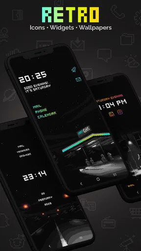
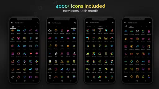
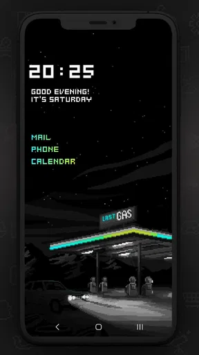
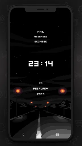
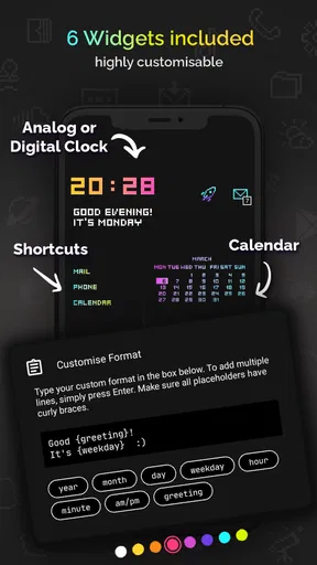
Let’s talk design. This icon pack is all about those vibrant colors and bold lines that scream 80s arcade vibes. Each icon is meticulously crafted with a neon glow that makes your screen pop. If you’re fond of aesthetics that are both playful and nostalgic, you’ll definitely appreciate the effort that has gone into these designs.
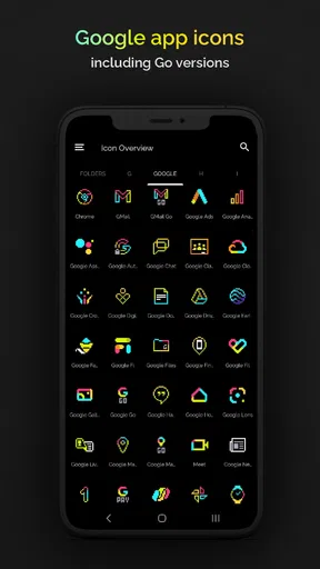
The icons cover a wide range of apps, ensuring that most of your favorites get a neon makeover. And if an app isn’t covered, the app’s masking feature ensures that it still blends in with the overall theme. It’s these little touches that make using this icon pack a delightful experience.
Features and Functionality
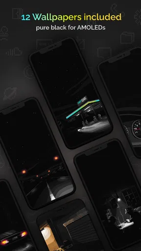
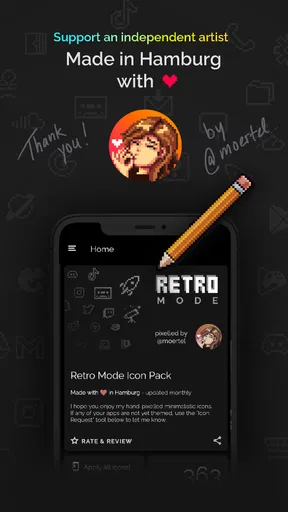
Beyond its eye-catching design, Retro Mode - Icon Pack (Neon) comes with a few neat extras. The app includes a selection of wallpapers that complement the icon pack perfectly, providing a cohesive look for your device. I spent a good chunk of time just browsing through the wallpapers, each more enticing than the last.
The app is also updated regularly, which means new icons are added to cover more apps over time. This is a huge plus, as it ensures the icon pack doesn’t become obsolete with the ever-changing app landscape.
Performance and Usability
Performance-wise, I didn’t notice any lag or hiccups while using the icon pack. It’s lightweight, which means it doesn’t burden your phone’s performance. Whether you’re a casual user or someone who likes to keep things snappy, this app won’t let you down.
In terms of usability, navigating through the app is intuitive. The layout is clean, and you can easily switch between icons and wallpapers. If you’re someone who enjoys customizing your device often, you’ll appreciate the ease of swapping things out.
Final Thoughts
So, is this neon icon pack worth your time? Absolutely. If you’re a fan of retro aesthetics and want to bring some of that neon magic to your daily routine, this app delivers in spades. It’s easy to use and visually appealing, making it a solid choice for anyone looking to spice up their phone.
For those who enjoy personalizing their digital space, this icon pack is a delightful way to express your love for all things retro. Whether it’s the vibrant colors or the nostalgic design, there’s something here for everyone. I’d recommend it to people who want a distinctive home screen and are happy to use a compatible launcher; if you prefer familiar default icons or a subtle look, a wallpaper change is likely the better choice. Try the icons on a single screen first, and keep the theme only if it makes your everyday apps feel easier and more enjoyable to use.
Pros
- Vibrant neon colors enhance any theme.
- Wide variety of icons to choose from.
- Frequent updates add new icons regularly.
- Compatible with most Android launchers.
- High-quality
- detailed icon design.
Cons
- Limited support for certain obscure apps.
- Not available for iOS devices.
- Requires a launcher for full functionality.
- Some users report occasional glitches.
- May not appeal to minimalist tastes.
FAQs for Retro Mode - Icon Pack (Neon)
What is Retro Mode - Icon Pack (Neon)?
Retro Mode - Icon Pack (Neon) is a customization app designed for Android users who want to give their device a unique, vintage look with a neon twist. The app offers a wide range of icons that can be applied to replace the stock icons on your device, providing a nostalgic yet vibrant aesthetic.
How do I apply the icon pack to my device?
To apply Retro Mode - Icon Pack (Neon), you need to have a compatible launcher installed on your Android device. Popular launchers like Nova, Apex, and Action Launcher support icon packs. Once you have a compatible launcher, you can apply the icon pack through the launcher's settings menu.
Is Retro Mode - Icon Pack (Neon) compatible with my device?
Retro Mode - Icon Pack (Neon) is compatible with most Android devices as long as you have a launcher that supports custom icon packs. It's important to check the app’s description for a list of supported launchers to ensure compatibility with your device before downloading.
Does the app offer regular updates?
Yes, Retro Mode - Icon Pack (Neon) is regularly updated to include new icons and improvements. The developers actively work to expand the icon selection and enhance the user experience, ensuring that your device stays fresh and visually appealing with the latest updates.
Are there any in-app purchases or ads in Retro Mode - Icon Pack (Neon)?
Retro Mode - Icon Pack (Neon) may include in-app purchases to unlock additional features or icons. The presence of ads can vary, depending on the version you download. It's advisable to check the app details in the Play Store for specific information regarding ads and in-app purchases.


